Monday, January 30, 2012

Still Life Composition and Color Part I

A good composition can really bring a painting to life. It can create a mood, add drama and bring balance to a painting. There is much debate what makes a good composition. Color is only one factor to consider when designing your painting. Before you begin, you should have a concept or idea how your painting will look. Creating a sketch of your idea allows you to analyze your composition better than viewing it in 3 dimensions. This post with focus on the use of color in designing your still life.

Harmonious Color
The overall look of your painting could be based on harmonious colors. They are colors that are next to each other on the color wheel. As examples, your objects could be blue/green, greens, and yellow/green.

Example of Harmonious Color


Complementary Color
The use of a complementary color adds vibrancy to a painting. Complementary colors are opposite each other on the color wheel. You don't want to use equal amounts of each color, rather your dominant color might be oranges with just a touch of blue here and there. Or your painting might be yellows with a touch of purple.

Example of Complementary Color


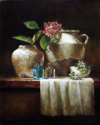
Whites and a Limited Palette
Painting a grouping of white objects with just a touch of color can make a very pleasing composition. You can play with the different temperature of lights to create interesting color variations. If using a warm light then the lit areas will be whites with warm pinks and oranges and the shadows cool blues and violets. A cool light will have the opposite effect creating cool blues in the lit areas and warm colors in the shadows.

Example of White Composition


A painting becomes cohesive if one color is dominant, whether it is a table of apples scattered around or like colors such as cheeses and bread on a wood table. Limiting the number of colors makes for a cohesive painting.
Example of Cohesive Color


As I said in the beginning, color is only one factor to consider when thinking about your painting idea or concept. Next week I will discuss other things to think about before taking your brush to canvas. Composition can be very challenging and frustrating so just keep playing, have fun and learn from your mistakes. Lord knows I have made plenty.

Thursday, January 12, 2012

Friday, December 23, 2011

FAV 15% for November FASO Contest


Knit and Purl
16 x 30
Oil on Linen

This painting was selected as part of the Favorite 15% of the FASO Bold Brush Painting Competition. I took a new photograph of the painting, hoping to get truer colors. I love my new iphone, takes amazing pictures.

Tuesday, December 6, 2011

New Painting


Knit and Purl
16 X 30
Oil on Linen

This was a bear of a painting. Trying to paint the knitting balls inside of a wire basket was much more difficult than I had thought. Paint and learn. I had to paint the knitting balls which wasn't easy, but then I had to paint the wire basket on top of balls and the shadow of the wires had to be incorporated into the details. Getting all the textures coordinated was a challenge.

Sunday, December 4, 2011

Composition of a still life

There have been long held beliefs on how the still life should be arranged for the viewers most rewarding experience.  This has typically been either the horizontal or the front to back viewing. The viewer's focus of attention was believed to travel from the left to the right or from the front to the back. New studies suggest however, that the viewer's eye actually darts around the canvas resting momentarily at different points of interests. 
Looking at the above painting, the old theory would suggest that the viewer would start at the bowl on it's side and move across the canvas to the garlic, the raku vase then the yellow vase, barely noticing the raku vase in the background. Through current research it has been proven that this isn't the case, and in fact the viewer may first focus on the center raku then move to the back raku then over to the bowl on it's side and then may finally rest on the yellow vase. No two people will view a painting the same.

Saturday, October 1, 2011

RED

I went to see the play RED at the Goodman Theater here in Chicago last week. On some level, I inspire to be like Rothko. He had such confidence in his abilities. I absolutely love his work. However, he had an arrogance that was both admirable and distasteful.
How can you turn down an opportunity to display your work in such a high profile venue as the Four Seasons? How can you display your work in such a pretentious atmosphere? He secretly resolved to create "something that will ruin the appetite of every son-of-a-bitch who ever eats in that room." From the play it appeared he lived a very lonely and unhappy life. That I do not aspire to.

Saturday, September 17, 2011

Materials

Thought I would post a blog of the materials I use in painting, framing and marketing.
I have done considerable research to find the best sources and materials.

Website:
I found Fine Art Studio Online to be an ideal web host for artists. In addition to being easy to set up, their technical support is superb. They have an artist forum, a monthly painting contest and an art collector newsletter that advertises the member artists.
http://faso.com/?gclid=CJXt0OL4pKsCFYjBKgode0dE2A

Frames:
I use frames from Art Ready Frames and Pictureframes.com (sample frame pieces are available for the cost of S & H)
http://artreadyframes.com/
http://www.pictureframes.com

Stretcher Bars:
I recently discovered the very well made bars of Upper Canada Stretchers. The Linen I use sits beautifully on these bars.
http://www.ucsart.com/

Substrates
In addition to Linen, I use Innerglow painting panels. They are 1/2 " thick acid free laminated boards and primed on both sides, which allows for experimentation or occasional disasters.
http://www.billewing.com/Panels.htm

Color Palette:
I have been experimenting with different colors lately, but for the most part, I use the following:
Naples Yellow
Transparent Earth Yellow (Rembrandt)
Venetian Red
Cadmium Yellow Deep
Cadmium Yellow Light
Cadmium Red Light
Cobalt Blue
Ultramarine Blue Deep
Burnt Umber
Raw Umber
Cremnitz White (LaFranc)
Permanent Alizarin
Transparent Oxide Red (Rembrandt)
Some colors have to be added depending on what is being painted. I have indicated which brands I am particular about. In general I use Old Holland and Winsor Newton paints.

Mediums:
I try and limit my use of medium because it really really smells.
Maroger made by Old Masters is the medium I use most.
http://www.oldmastersmaroger.com/?gclid=CMOasqL6pKsCFYbsKgod7gxg4w
Other mediums I have used are Linseed Oil, Neo Meglip and Liquin

Oiling Out:
In order to even out the sheen on my paintings, I "oil out" before each painting session. With each successive painting session and oiling out, a nice finish begins to develop giving the painting an old work look.
60% mineral spirits (Gamblin)
30% stand oil
10% gaklyd

Brushes:
I paint mostly using Filbert Longs as they allow more paint to be picked up with each stroke.
Trekell and Robert Simmons Signet are both excellent brushes. Simmons brushes can be purchased at most online art supply companies. Trekell brushes can also be purchased online.
http://www.trekell.com/
Another brush that is so nice for details, as well as blending is the Langnickel Royal Sable Long-Handle Brush.

BTW
New Painting...

Pink and Green Hydrangeas
16 X 20
Oil on Linen

Lois
www.loiseakin.com